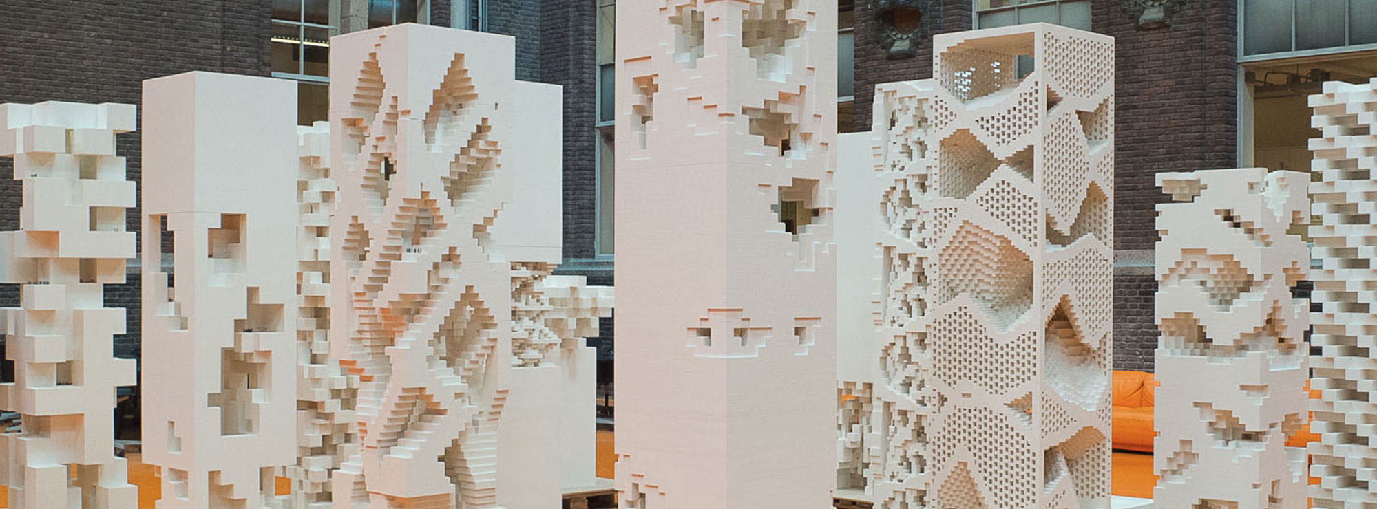
I am a huge fan of Lego fan and a huge fan of architecture. I believe Lego made an amazing product by combining the both in Lego Architecture Studio. The Studio is almost a perfect product which succeeds in two goals: teaching children and inspiring adults.
However, I believe it can be even better.
Lego Architecture Studio focuses on architecture as a design of big sculptures. In this way, it reflects a popular understanding of architecture as a visual design discipline. It is important to enjoy the beauty of a construction, but architecture is much more than that. Architecture must solve complex problems of building, living, and sustainability. And it must balance solutions these by making them work together.
While the Studio book includes inspiring texts by notable architects such as MAD, SOM, and Safdie, the actual bricks do not support a bigger functional vision. All bricks are white. There are no other colors. There are no colors for green surfaces, water, and earth. White bricks represent the construction materials: concrete, stone, steel, and allow designers to design abstract shapes. However, this monochromatism creates a strong misleading impression that architecture is that simple.
Adding green and blue bricks in the Lego Architecture Studio, designers will gain a clearer concept of the importance of these two elements. Both green and blue will intuitively and unmistakenly represents water and green surfaces. Children will learn and adults will be inspired to see architecture as more than a form, but as more complex problem-solving which must involve these two natural elements.
Top photo is from a Lego PLAYTIME by Krads. Their lego architecture workshops resulted in amazing models, but again only in white with nature excluded.

